


How to Choose Colours for Your Personal Brand
Don't choose colours *just* because you like them
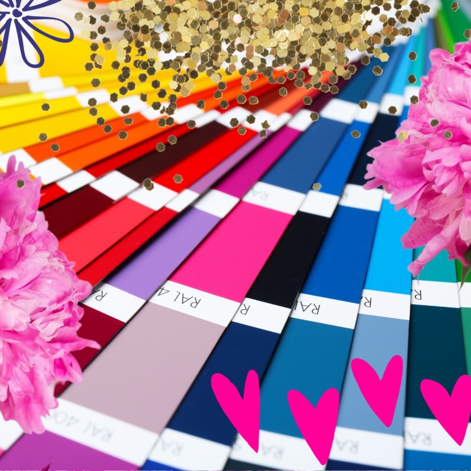
You need to think about the messages you want to convey and how you want to be perceived and then look at the psychology of colour. Colours are associated with different moods and emotions. Any graphic designer worth their salt should be able to advise you but here are a few examples of colours with their associations as we see them in the western world:
Blue is often used in business as it is associated with trust, strength and loyalty.
Red conveys confidence, love. Passion and excitement but it can also represent danger.
Yellow is fresh, optimistic, and cheerful.
Orange is friendly and warm.
Pink is linked to caring, youth and innovation.
Purple for quality and luxury.
Green for nature and peace.
White for purity and innocence.
Black is associated with mystery and power.
What colours suit YOU?
The main thing to understand with colour is, whether you suit a warm or cool palette. There are warm and cool versions of every colour except orange so if red is your thing there will be a red to suit you, same with blue, green, purple etc.
I often see women in business wearing their brand colours just because they are their brand colours but that is not always a good thing. Especially if they are on the opposite side of the colour wheel to their natural colouring– it can look a bit ‘off’ if the colour is not naturally harmonious.
For example vibrant magenta pink will look amazing on someone who has naturally striking dark contrasting colouring and falls in the cooler categories in terms of colour analysis. The same hue on someone with softer, less striking natural colouring could seem overpowering and they would need to ramp up the makeup, so the colour isn’t wearing them.
When you wear a colour that suits you it will give your skin a natural radiance and your eyes sparkle without resorting to lots of makeup. When know which colours suit you best you can incorporate the right shades and tones into your branding. You can create visual harmony with your brand when you are going for that professional photo shoot or dressing ‘on brand’ for networking etc.
This in turn sends out a message. You’ll look more professional and together.
For example you might think black is easy and looks smart, business like and professional, but what if you’re in that large percentage of the population that black doesn’t actually suit? Your natural colouring is fair? You have strawberry blonde hair and hazel eyes, your features are quite delicate... by wearing black, especially near your face it will create shadows around your eyes and you look like you need a good night’s sleep. Navy is a great alternative to black, it’s a universal colour and suits everyone.
If you’d like my colour analysis cheat sheet you can get it here or book a personalised colour analysis reading with me if you’d like to know for sure.
How do you want to be perceived?
What messages do you want to convey about yourself and your brand with how you look? What does your personal style/image say about you? We are visually communicating something about ourselves all the time with how we look.
When I work with clients we spend a lot of time narrowing down what I refer to as ‘DUCK’ * words – these words become the measuring stick for everything about your brand. For example mine are: sassy, creative, fun, stylish and vibrant – everything I do in biz has to stack up against those words from the way I look, sound and present images. *Duck words....’if it looks like a duck, quacks like duck and swims like a duck then it probably is a duck’.
You may want to come across as creative and quirky perhaps? Warm and approachable? Or proficient and serious might be more your vibe...So no one is going to think of you as creative and quirky if you rock up in a business suit for example. Neither are you going to seem warm and approachable if you’re wearing a very high contrast outfit like a black jacket and white top – this would represent authority and power – think police uniforms, prison officers, judges etc.
What should you wear for a photo shoot?
This is when all of these aforementioned tips come together.
Imagine how you’ll be seen in your profile picture or on your website against your branding. Know what colours suit you and choose clothes that are going to be harmonious with your brand colours. No point wearing loud, bold prints in rainbow colours if your branding reflects serenity, calmness and nature and is soft subtle shades of greens and blues.
Think about how you want to be perceived and make sure that your chosen outfits are appropriate. Take a few changes of clothes to get different aspects of your personality across if you’ll have time to get changed. Don’t dress differently to how you would in your day to day role – be authentic. You don’t want prospective clients to be shocked when they meet you in real life after seeing your images on social media or your website because you don’t look like the same person.
Consider enhancing your feature with makeup but make sure that you don’t end up looking like someone else. If you don’t normally wear makeup you’ll only feel self conscious if you have the full works – it’s definitely worth having it done by someone who knows what they are doing as long as you communicate your likes and dislikes effectively. You don’t want to meet people in real life after they’ve seen your images online and for them not to recognise you – you want to look like a polished and well groomed version of yourself in your pics.
I know someone who had beautiful naturally wavy hair and just wore a little bit of makeup generally. She had a photo shoot and was primped and preened by a hair and makeup artist, gave her the full works with perfect foundation, contouring etc, straightened her hair into a sleek bob – she looked amazing! Her photos came out brilliantly but she didn’t look like herself, the images were so incongruent with everything she represented in terms of her business that she didn’t seem authentic. Nor did people relate to her initially once they met in real life after seeing the photo first.
Cohesive, consistent personal style and brand makes you more memorable
My personal branding has evolved over the years but has been fairly consistent in terms of colour. Obviously, I know what colours suit me because that’s one of my areas of expertise. I’ve always been mindful of my brand values and the psychology of colour around them. Then worked with colours I like and are harmonious with my personal style too.
Once you have your branding sorted it means you have guidelines to give to your web designer and photographer. Cohesive, consistent personal style and brand makes you more memorable and you stay front of mind for when your prospective clients are ready to buy. When your branding is so ‘very you’ you will stand out from the crowd, be memorable and not get lost in a sea of sameness along with your competitors. It also helps create a sense of who you are, which accelerates the know, like, trust factor and creates a short cut to building rapport. When you get it just right and throw in value adding content, you’ll transform from a boring personal bland to a banging personal brand.
Share this post: