


Meet Holistic Helen
Judged on appearance
A few weeks ago I was chatting with one of my FAB Network members about a series of ‘characters’ I created when I first started blogging many years ago. I’d forgotten all about them but decided I’d check in on my old friends to see how they were getting on. This week I’m going to introduce you to one of them…
It’s a well-known fact that we are judged by our appearance, this extends across all of your branding; in business especially, assumptions can be made on your level of success.
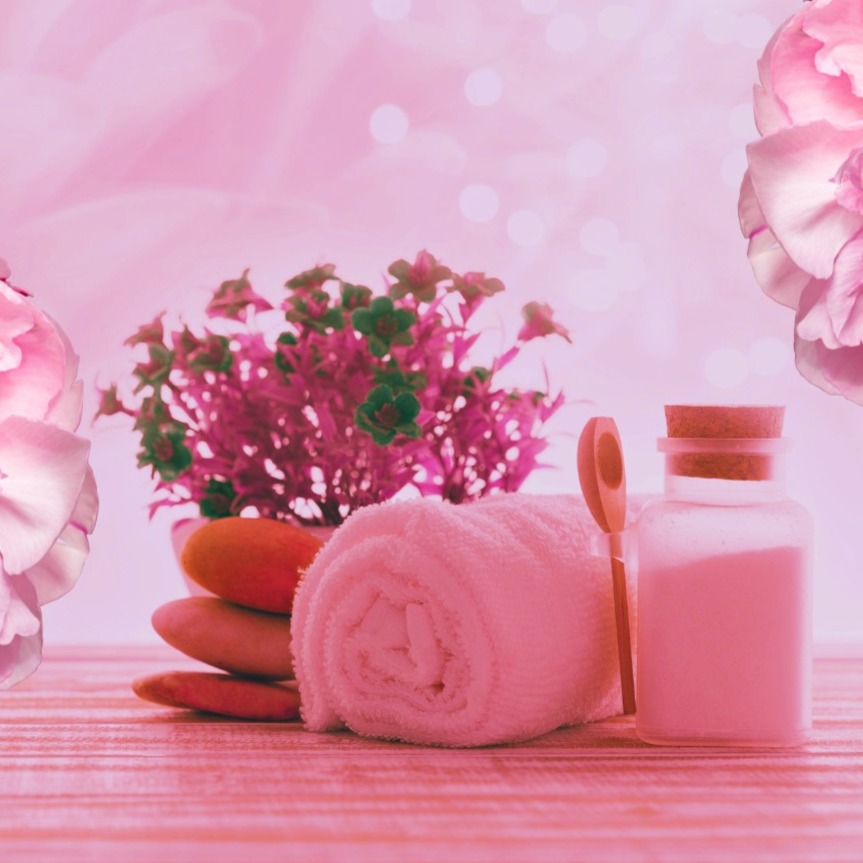
This is the story of Holistic Helen, she’s such a lovely, soulful lady who is very heart centred and likes to help her clients feel really special. She uses massage and other holistic therapies and has an interest in organic skin care products. She wants to convey a calm, professional, caring, natural feel around her business message.
Low cost business cards
A while ago, when she set up in business, she got some business cards made. She didn't have much spare cash so went on one of those websites that has low cost printing and you design your own cards using their templates. Brilliant! She loves red and orange, they’re her favourite colours and there's a lovely template with a flower on it. She clicked edit and cracked on. It's miles cheaper to buy a lot and she'll be handing your cards out like Smarties because everyone in the world will want to know about her business... 5000, red and orange business cards arrive...
She has a uniform for her business. It's massage therapy and she need to be comfortable, have ease of movement and for it not to show oil marks. Black is practical and easy to get cheap stuff from anywhere -perfect solution.
She created a Facebook page for her business; she wanted to portray a nice relaxing mood so used a stock photo of some pebbles and candles in nice muted, neutral tones.
She uses a lovely photo of herself on holiday as a profile pic. It shows her all smiley and happy with the mountains in the background, you can't really see too much of her face (she hates pics of herself) because she has her sunglasses on and straw hat to keep the sun off her face.
Personal brand checklist
Business is going well, and she starts to attend networking groups, she can't go in her uniform, her suits from her previous life seem a bit formal and it's always seems a bit stressful getting ready.
She’s also looking at doing live content and making little short videos to spread the word about her biz but get a bit nervous about it all... Should I wear makeup, do I need to dress up, is the lighting right etc?
Let's have a quick look at how Helen’s doing so far...
She has red and orange business cards; those colours suggest love, anger, passion, danger and fun, friendly, energetic, zing.... There's a stylised picture of a flower which is a nod to nature though... (she's still got over 4500 to get rid of despite throwing them around like confetti)
The stock photo on her Facebook page is a bit better at conveying calm...
The profile pic is difficult to tell what she looks like
When Helen meets clients, she looks tired and drained because she is wearing black, and it really doesn't suit her natural colouring. She's got fair hair, pale blue eyes and fairly pale skin...by wearing black, especially near her face it creates shadows around her eyes. This is not the picture of glowing health and vitality that she'd like to be portraying.
What messages are you conveying with your brand?
Helen has not stopped to think about the connection between the different elements of her branding. There is a relatively simple way that she can really enhance and improve the overall look and feel of her professional image. It’s using appropriate colour.
Have you ever stopped to think about how colour can affect the look and feel of your business? You may now be at a stage where you want to move up a gear, put yourself out there more and really think about yourself as a brand.
It's all well and good having a great logo specially designed for you in your favourite colours but have you stopped to think about what messages those colours convey. A good designer will stop and get you to consider the psychology of colour when you are at the planning stages. But I'm advising that you take it even further than that.
What colours actually suit you?
What colours make you come alive, give your skin a natural radiance and your eyes sparkle without resorting to lots of makeup. If you know which colours suit you best, you can incorporate the right shades and tones into your branding. You can create harmony with your brand.
For example, if Helen changed her uniform to marine navy, which is much warmer and less harsh than black it will bring out the colours in her eyes, reduce the shadows and give her skin a glow, she’ll look healthier and not drained.
Neutral colours really suit her, tones if camel, beige, stone, as do fresh greens and blues, coral, peach, yellows and the colours of fresh spring flowers. Nothing too dark or bold...
Imagine if she used a range of colours that really suit her within her branding. It would bring everything together. She could choose colours from her palette that convey the right message for her business. .... Remember those words? Calm, professional, caring, warm and natural.
She could ensure that the wall behind her when she's recording is in one of the colours that IS going to complement her branding and not cast shadows on her face.
When she's shopping for clothes for networking and meeting potential new clients, she can be confident knowing that the colours she is wearing really make her look her best. When she knows that she's looking good she feels good, and it gives her confidence.
When she hands out her business cards and they are harmonious with her brand she will be conveying professionalism. (She will be able to afford new business cards and throw the old ones away because she's saving money when she's shopping for clothes.)
No more buying stuff that never gets worn and stays in the back of the wardrobe, she now only buys the colours that she knows really suit her. It makes shopping easier too, so easy to scan the shop for the 'right' colours. Nothing here? Next shop.
The main thing to understand with colour is, whether you suit a warm or cool palette. If red is our thing there will be a red to suit you. There are warm and cool reds... same with blue, green, yellow, purple etc
The beniefits of colour analysis
I’ve had clients describe the benefits of colour analysis as life changing, confidence boosting and empowering amongst other things. Investing in a colour analysis consultation can really help you boost your branding and unlock the visual potential of your business. It’s like the gateway to better, more cohesive personal branding. It remains one of my most popular services and is where I tend to really geek out. You can find out more about it here. There are lots of colour blogs on my website here. I even have a free cheat sheet if you fancy trying your hand at self-assessment.
Share this post: